Mapper
Tools
- C++
- OpenGL
- GLSL
- GLM
- GTK
- OpenStreetMap
- ArcGIS elevation
- NREL SPA
Overview
Mapper is a desktop map of any city, built in C++ over a semester. It has everything a map is expected to have: a styled 2D map, search, turn-by-turn directions for walking and driving, and a courier route optimiser. Next to it is a 3D viewer that rebuilds the city from open data, with terrain, landmarks, trees, and a sun that sits where the real one would at any hour, so you can see what a place looks like before you go.
Team
- Reyab Saluja
- Jet Chiang
- A. Ali
The Brief
Mapper started as the project in ECE297, the University of Toronto’s software design course, where every team builds the same thing: a map application on top of OpenStreetMap, delivered as four milestones. The first is fast spatial queries over a city’s streets and intersections, the second a drawn and searchable 2D map, the third pathfinding, and the fourth a travelling courier problem, where a single driver has to visit a list of pickups and drop-offs as cheaply as possible.
Those milestones are graded against the same tests for everyone, so the algorithms had to be good. But a map that only answers “how do I get there” leaves out most of what people actually want to know about a place: what it looks like, what you will see from it, whether the terrace faces the sunset. Nothing in a flat map answers that. So on top of the required work, the team built a second viewer that rebuilds the city in three dimensions, lit by the real sun, and tied the two together.
The presentation that closed the project walked through it in three parts: the 3D viewer, the 2D map, and the map algorithms. This page follows the same order.
The 3D Viewer
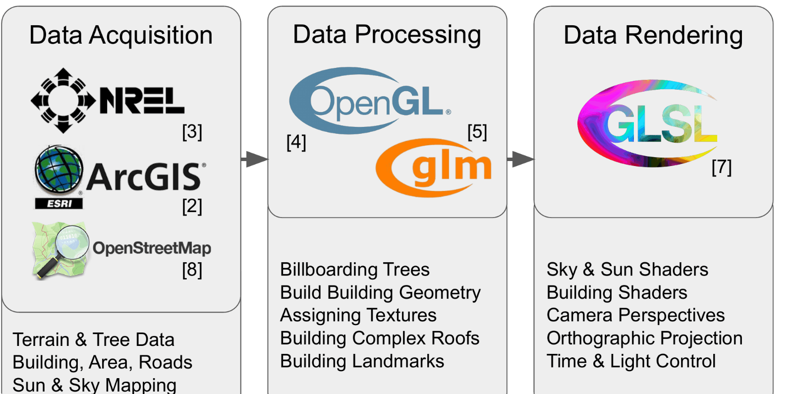
The viewer is a pipeline with three stages. Acquisition pulls buildings, roads, areas, and trees from OpenStreetMap, elevation from ArcGIS, and the sun’s position from NREL’s solar position algorithm. Processing turns that into geometry with GLM: building meshes, complex roofs and landmarks, billboarded trees, and texture assignments. Rendering is OpenGL and a set of GLSL shaders for the sky, the sun, the buildings, and the camera, including an orthographic top-down mode.
Eight problems had to be solved along the way, and each one below follows the same pattern: what the data gave the team, what was wrong with it, and what it took to make it look right without making it slow.
Buildings, Roads, and Areas
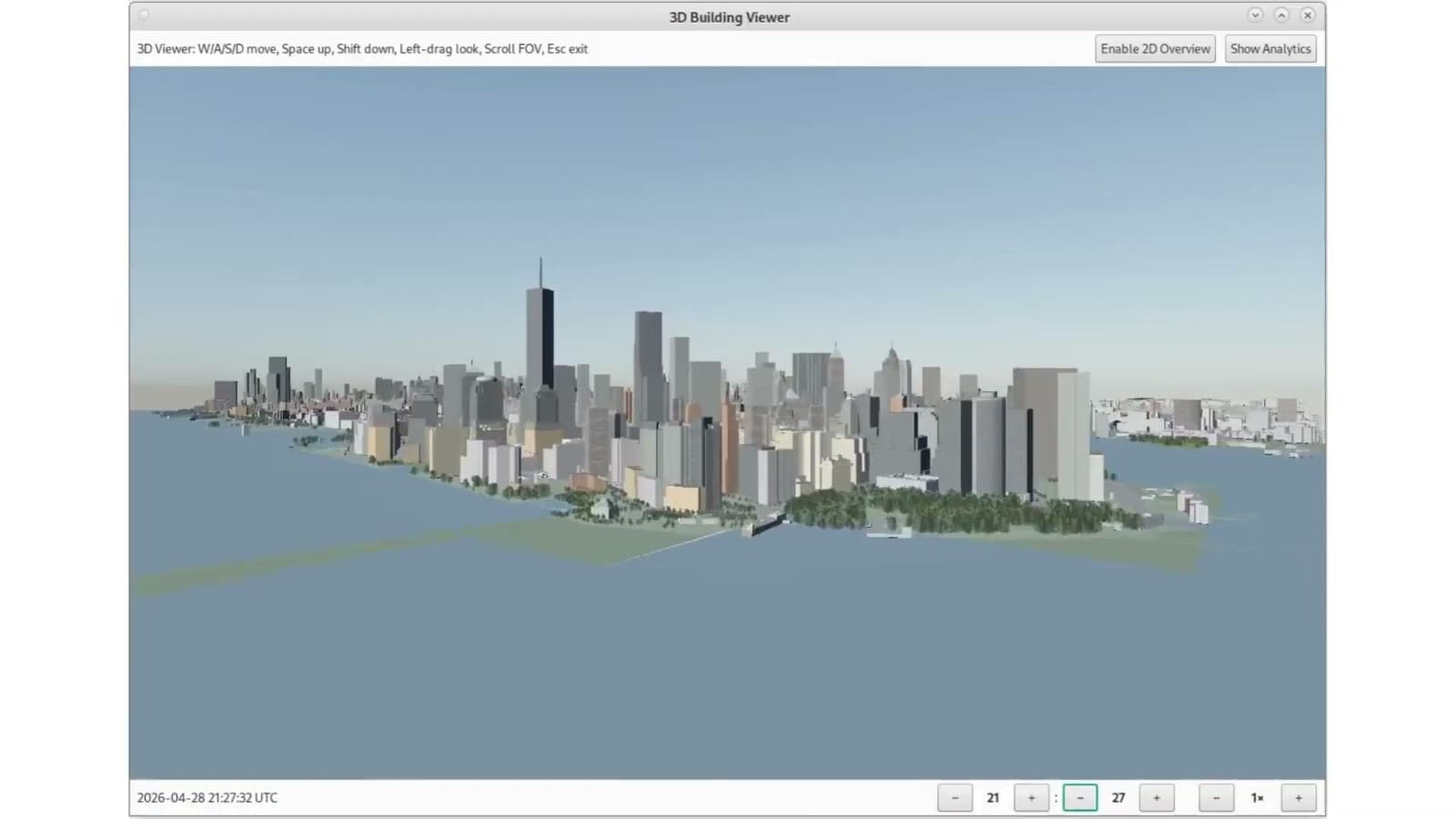
The foundation is accurate footprints. Every building in OpenStreetMap is extruded from its outline to its tagged height, roads are laid down as geometry rather than drawn on top, and land use areas, parks, water, and plazas, become coloured surfaces. The result is the whole city at once, at its real proportions, which is already more than a 2D map can show: which towers are actually tall, and where the dense parts of the city are.
Terrain
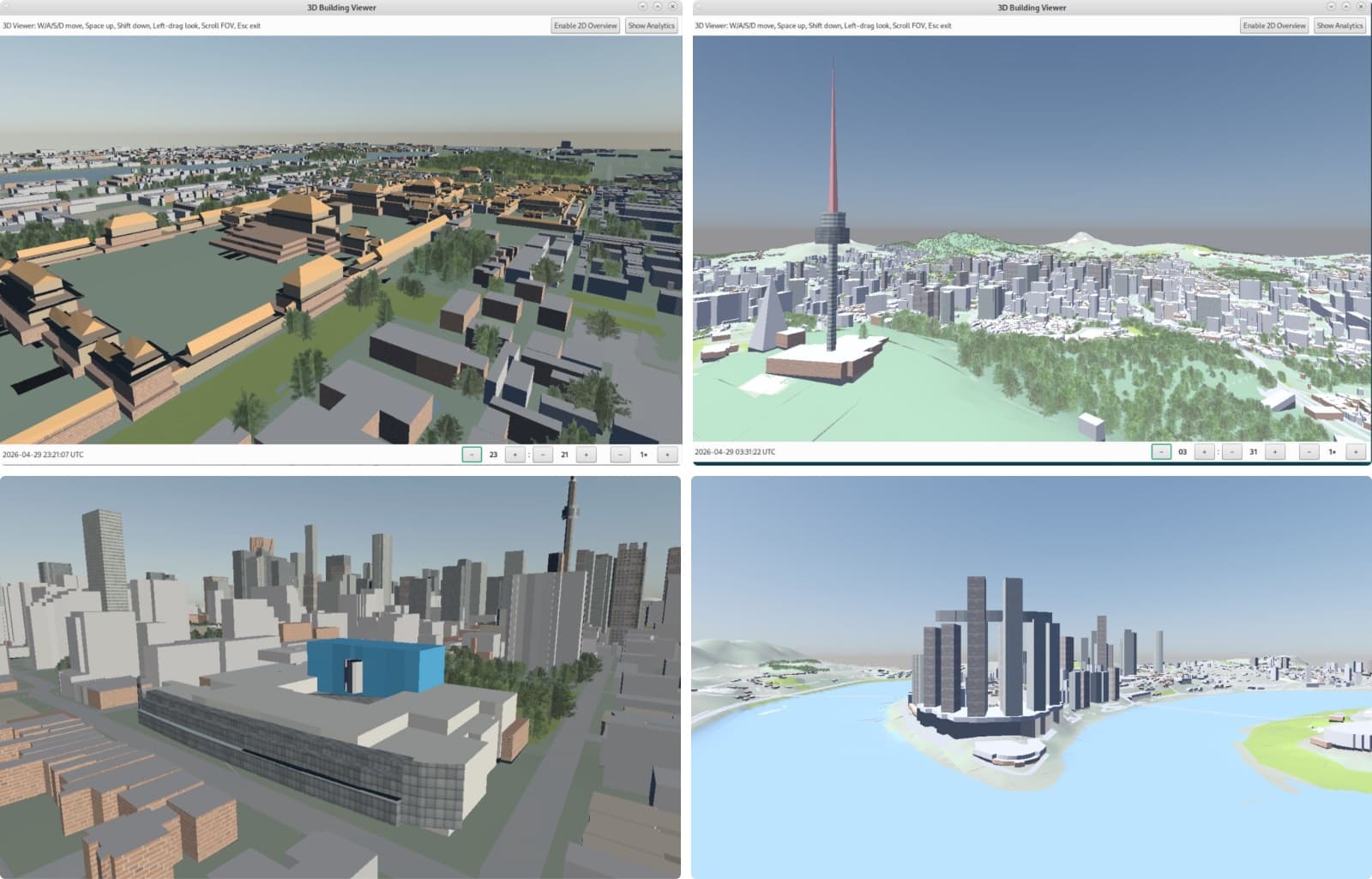
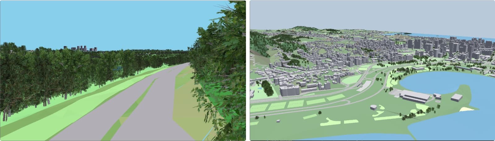
A city on a flat plane is not the city. Hills decide sightlines, and without them a viewpoint that looks out over the water in real life looks into the side of a building. So the ground is built from ArcGIS elevation data, sampled per vertex into a terrain mesh.
That created the first real problem. OpenStreetMap areas, parks, water, and so on, arrive as flat polygons, and draping them over the terrain puts two surfaces in almost exactly the same place. The GPU cannot decide which one is in front, so they flicker through each other as the camera moves. That is z-fighting, and at city scale it covers everything.
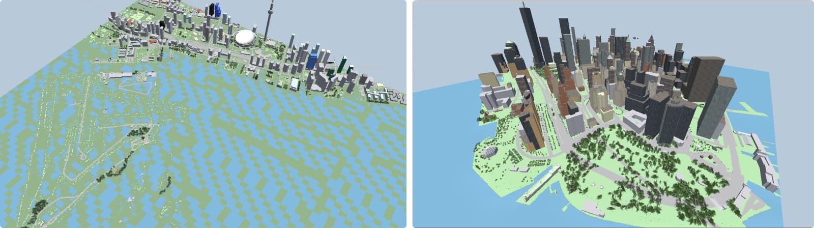
The fix was to stop layering and start cutting. The edges of each OpenStreetMap area are projected onto the elevation mesh and cut into it, leaving area-shaped holes in the terrain. The area’s own mesh is then interposed into each hole, following the ground beneath it. There is only ever one surface at any point, so there is nothing left to fight.
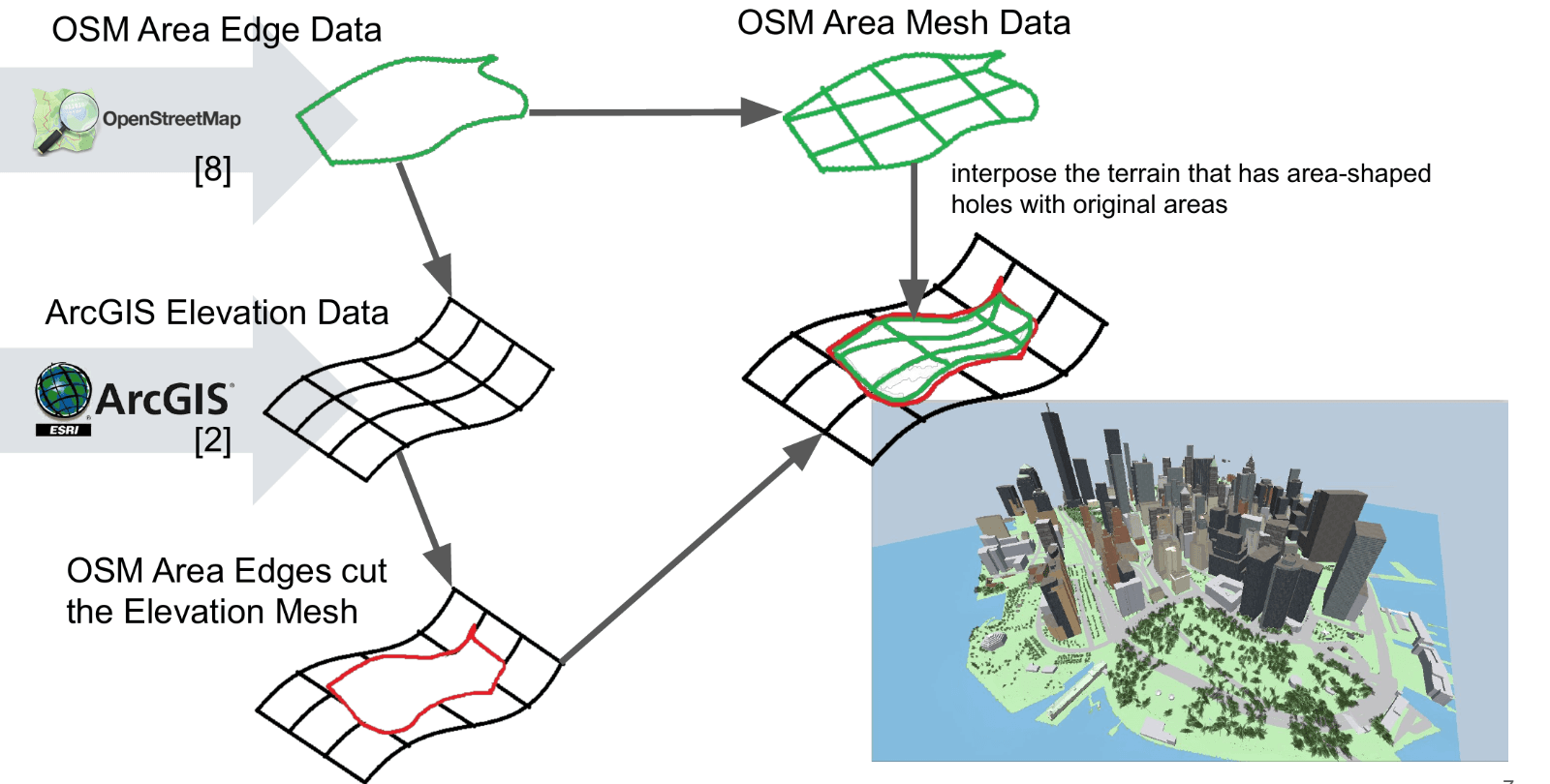
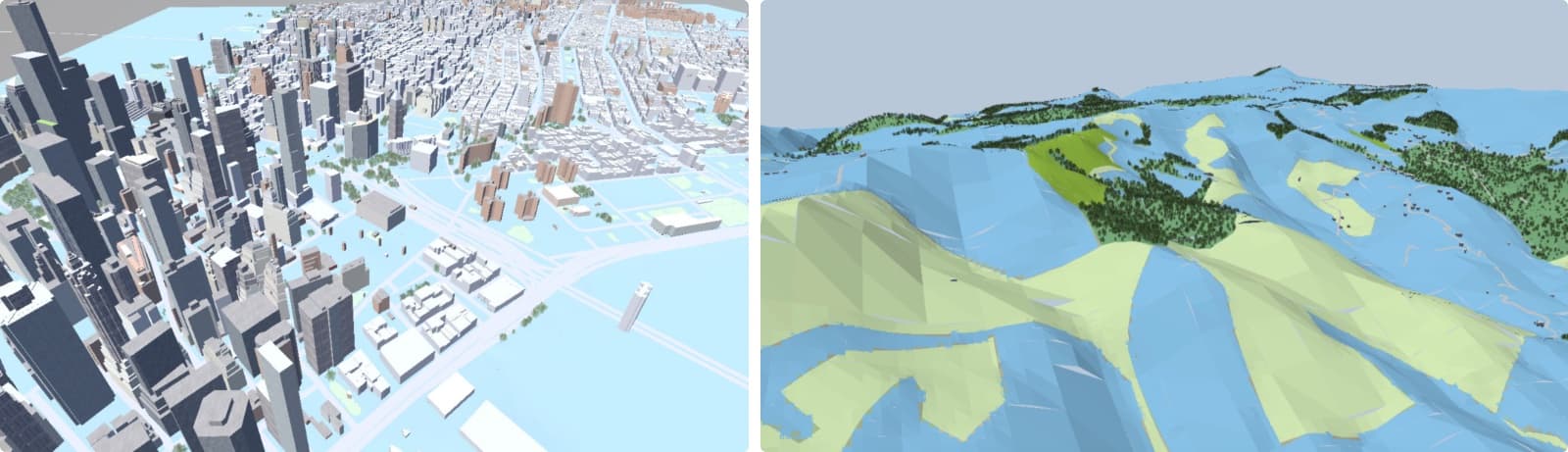
Solving that exposed the next one: water cutting into land. Some water polygons overlap the shore, and cutting them in faithfully flooded parts of the city. Careful rules about which areas take precedence left a final mesh that holds up at street level, which matters because the viewer also has a pedestrian mode where you walk on it.
Landmarks and Complex Roofs
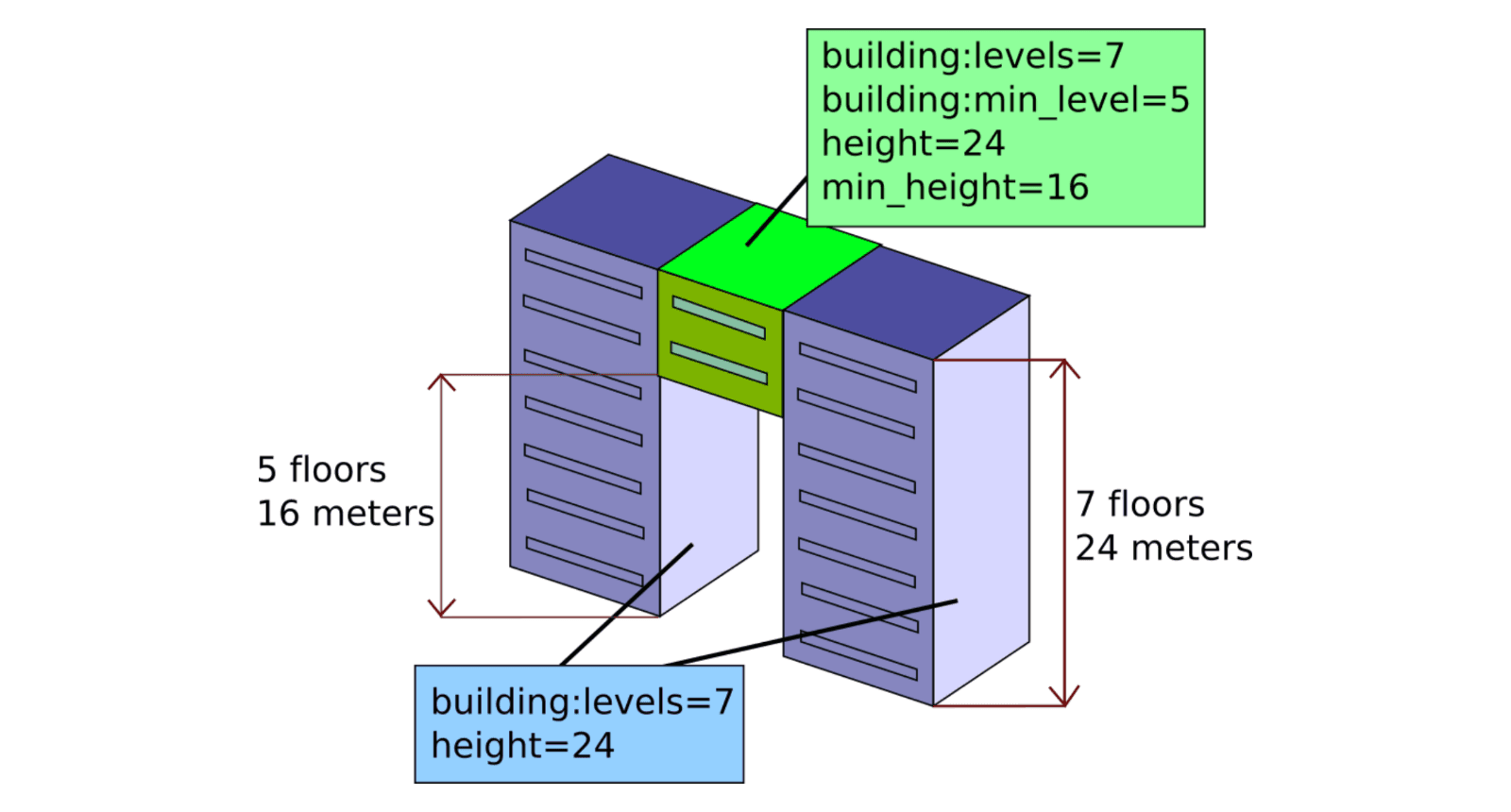
People find their way by landmarks, and landmarks are almost never boxes. OpenStreetMap describes them as parts: a building is a set of pieces, each with its own building:levels, min_level, height, and min_height, stacked into the real shape. A tower on a podium, a bridge between two blocks, or a spire on a roof are all parts.
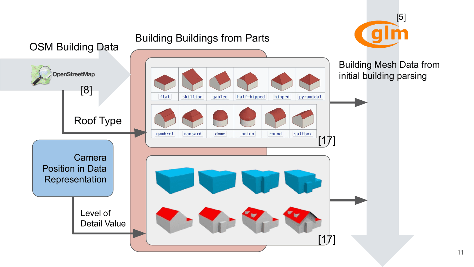
Roofs are tagged the same way. The viewer reads each part’s roof:shape and builds it: flat, skillion, gabled, half-hipped, hipped, pyramidal, gambrel, mansard, dome, onion, round, and saltbox. The level of detail follows the camera, so a part far away is drawn as a simple block and gains its real roof as you get closer.
Together, parts and roofs are what turn a field of extrusions into places people recognise: the Forbidden City’s halls, Seoul Tower on Namsan, the Art Gallery of Ontario, Chaotianmen in Chongqing. They are also views a 2D map cannot give you at all.
Time of Day
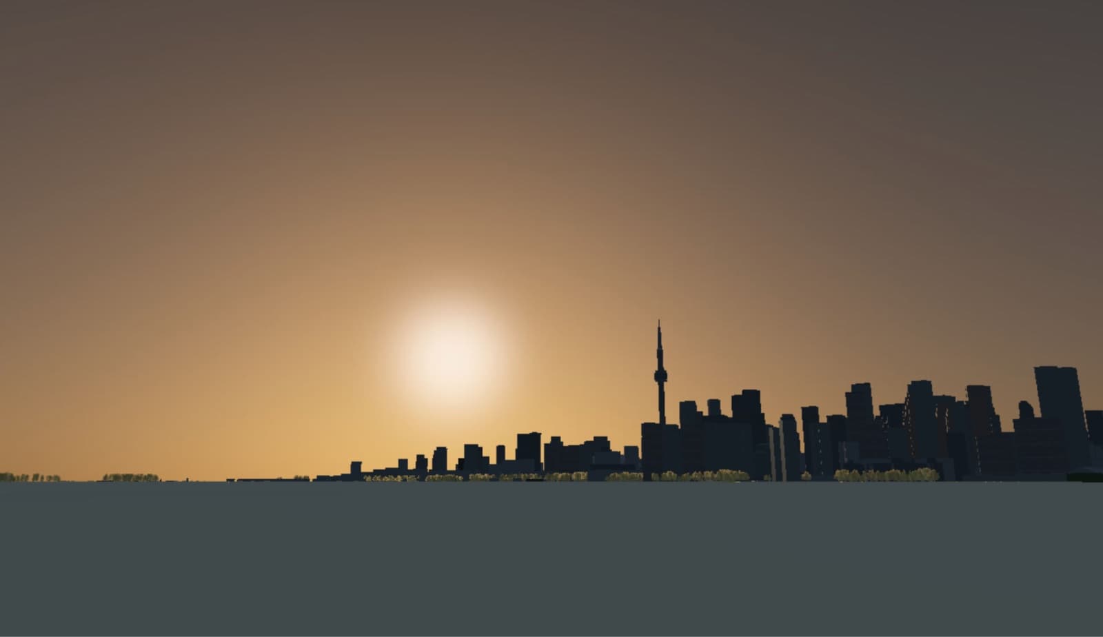
Light is most of what makes a render feel like a place. When the viewer starts, it takes the city’s latitude and longitude and the chosen date and time, and runs NREL’s Solar Position Algorithm to find where the sun actually is and how much light it is giving. That drives a Hosek-Wilkie sky model, evaluated from precomputed coefficients, which produces the colour of the whole sky for that sun position.
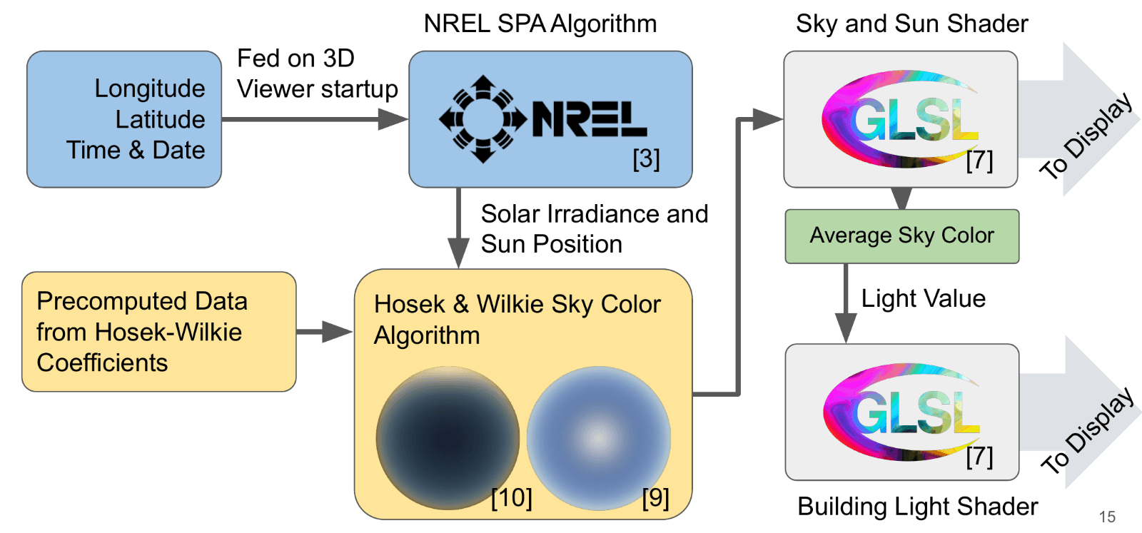
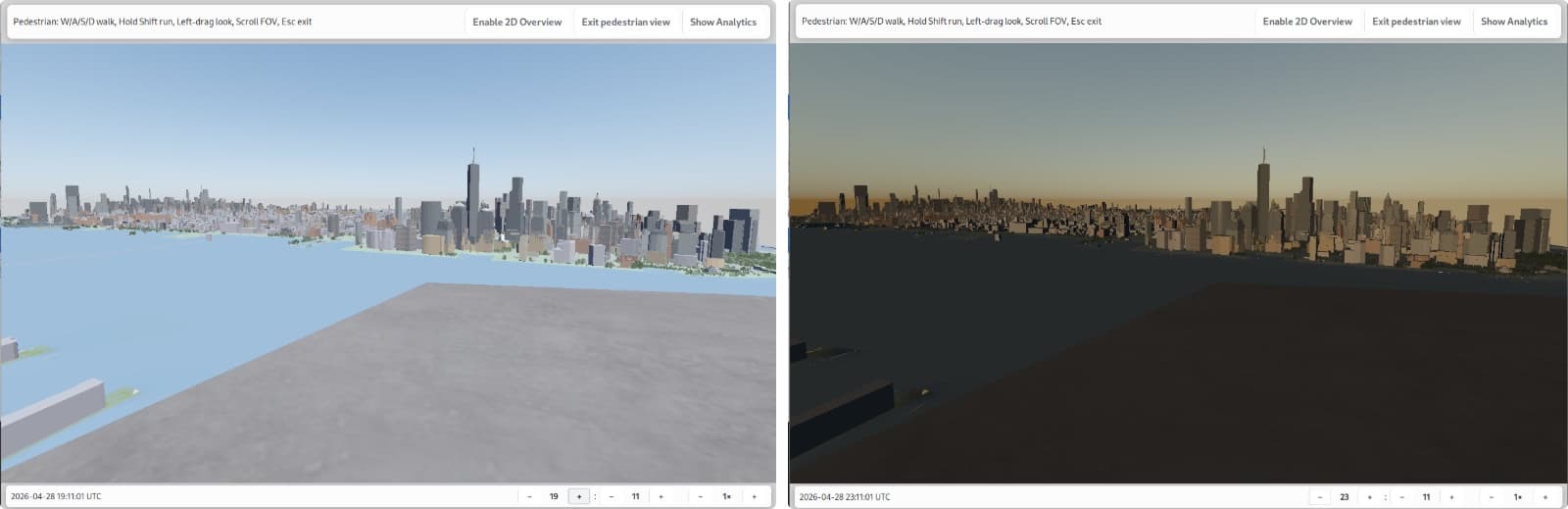
The sky is cheap to evaluate in a shader, and it does double duty. Its average colour becomes the light value for the building shader, so the city is lit by the sky above it: warm and low at sunset, white at noon, and dark blue after dusk, without anyone picking a colour.
Trees
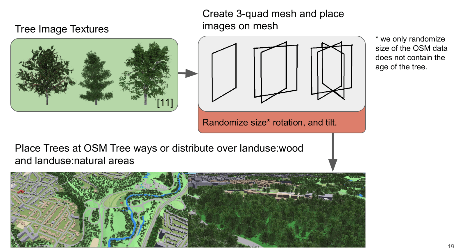
A city needs thousands of trees, and a real tree mesh has thousands of triangles. That multiplies into a frame rate nobody can use, so mesh trees were ruled out early. Instead each tree is a billboard: three quads crossed through each other, each carrying a photographic tree texture, which reads as a full tree from any direction at a tiny fraction of the cost.
Trees are placed wherever OpenStreetMap marks a single tree, and scattered across areas tagged as woods or natural land. Each one is given a random size, rotation, and tilt so a forest does not look stamped. The size is the only thing that has to be invented, since the data does not record how old a tree is.
Ground and Building Textures
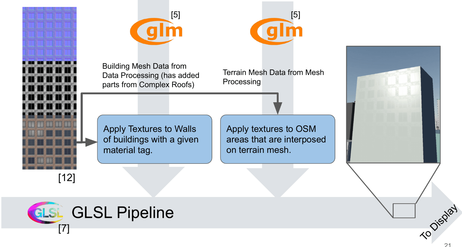
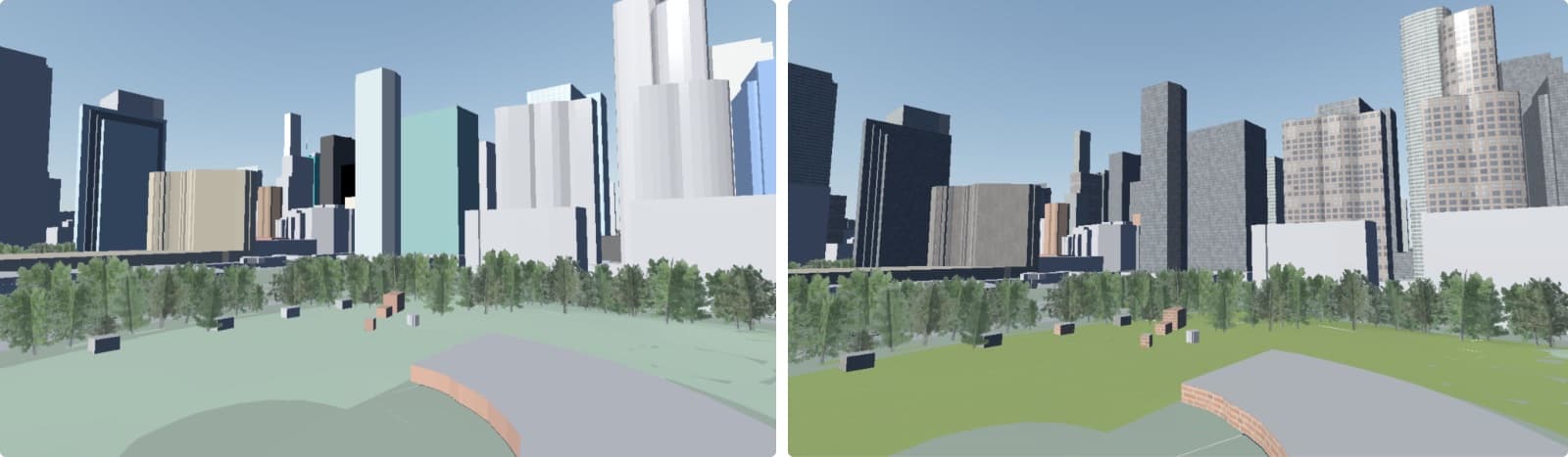
Solid colours are good for telling buildings apart and bad for believing in them. The next step was texture: walls take a facade texture chosen from the building’s material tag, glass, brick, or concrete, and the ground areas cut into the terrain take textures of their own. Both run through the same GLSL pipeline as everything else.
Shading
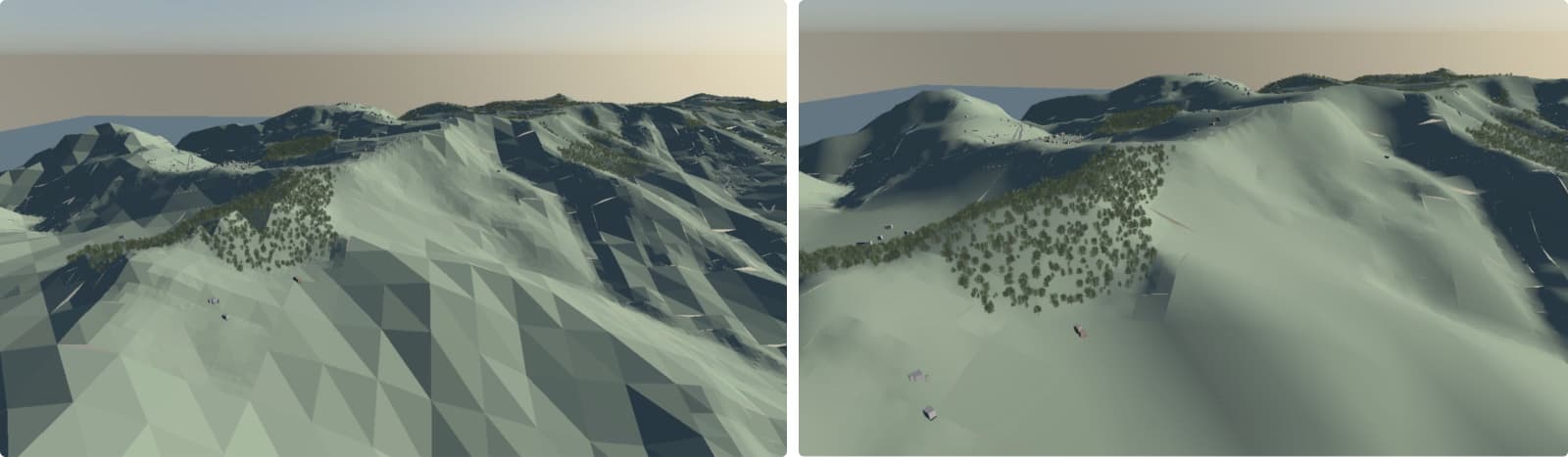
Two shader decisions do most of the work. The first is smooth shading. With one normal per face, a curved surface shows every triangle, and the only fix is more triangles. Interpolating normals across each vertex instead lets the GPU shade a coarse mesh as if it were smooth, which moves the cost from geometry, where it is expensive, into the fragment shader, where it is nearly free.
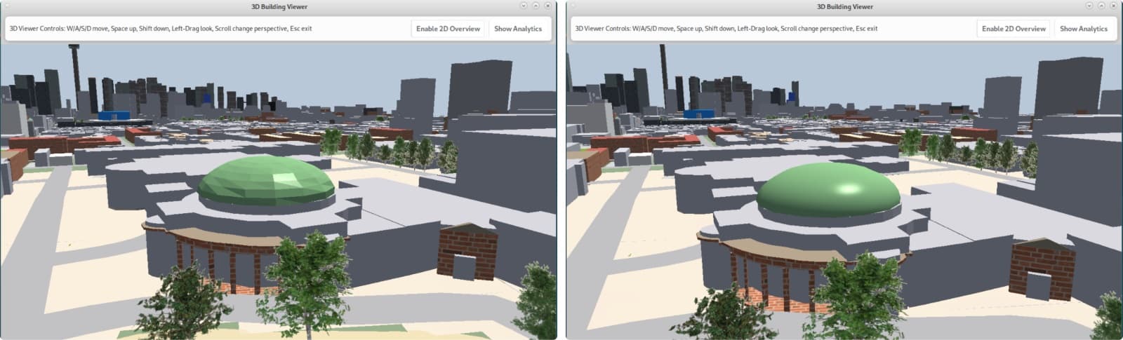
The second is the Blinn-Phong lighting model, built up in layers. Direct sunlight on its own is harsh: the side facing away from the sun goes black, where in reality the atmosphere bounces light around. A simple ambient light on the opposite side fakes that bounce. The result still looks matte, so a sharp specular highlight fakes reflection. Three cheap terms together read as a lit city.

Performance
Every choice above was made against one number. Nielsen puts the limit of feeling responsive at a tenth of a second: past that, the user feels they are waiting on the program rather than using it. The renderer was held to it. Three principles did most of the work:
Balance detail
Spend detail where the eye is. Roofs gain their real shape up close and stay simple in the distance, and a forest is billboards rather than meshes.
Cheat
Fake real-world systems with approximation and precomputation. The sky comes from precomputed coefficients, bounced light is an ambient term, and smoothness is interpolated normals.
Cull
Skip what cannot be seen from where the camera is and where it is looking.
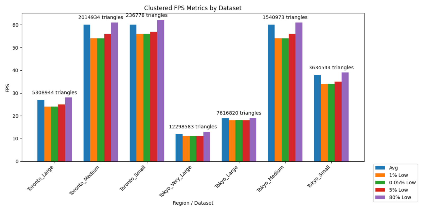
Measured at 1920 by 1080, the medium and small Toronto and Tokyo scenes hold around 60 frames a second, and a large Toronto scene of 5.3 million triangles holds around 27. The worst case, a very large Tokyo scene of 12.3 million triangles, still averages 12 frames a second, with its slowest frames staying under the tenth-of-a-second line.
The 2D Map
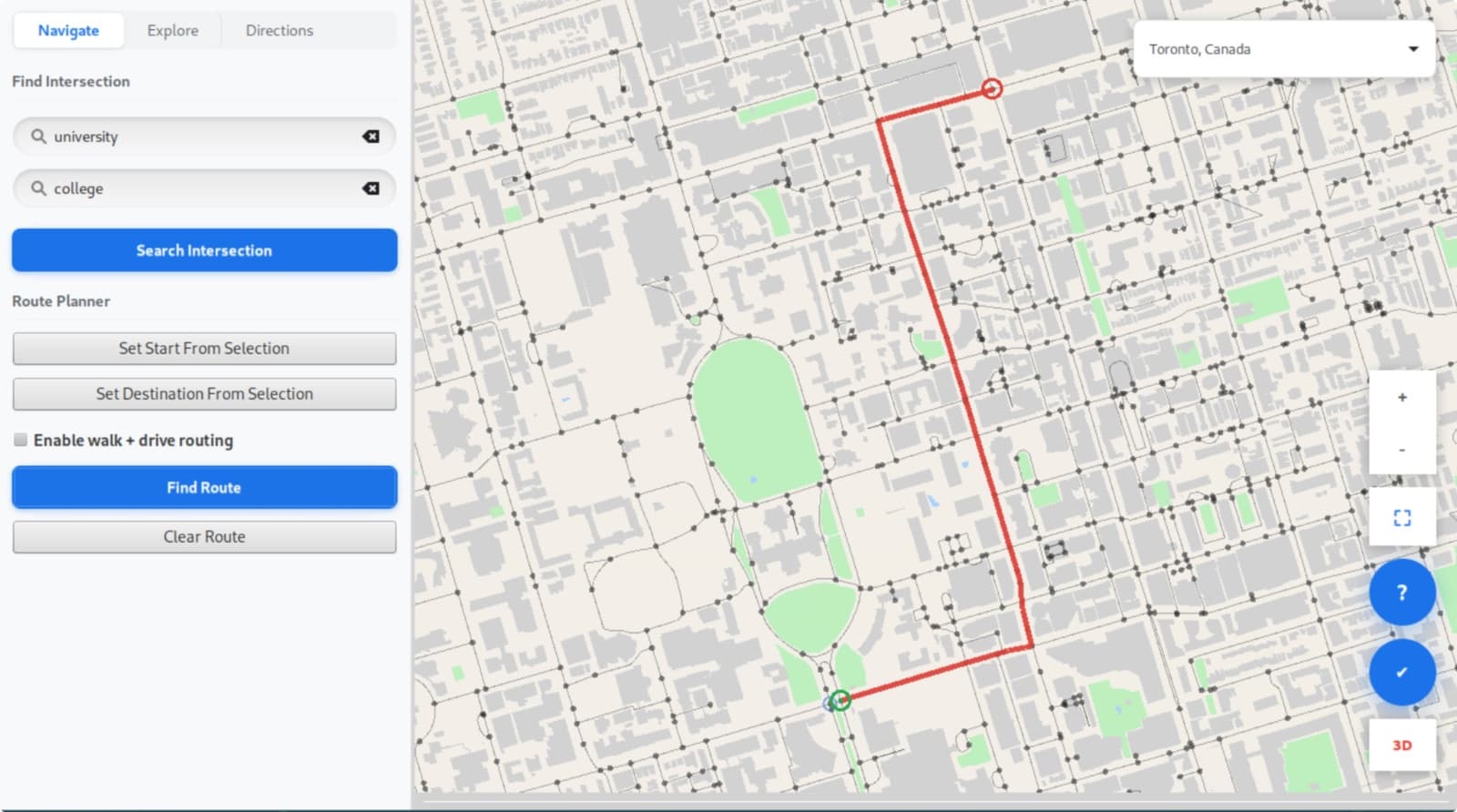
The 2D map is where most people start, and it had to feel like a modern map app rather than a course assignment. It is organised around three tabs, Navigate, Explore, and Directions, with the map taking the rest of the window and a button that opens the 3D viewer at the same spot.
Custom Styling
The interface is styled with CSS rather than the toolkit’s defaults: the side panel, text boxes, buttons, and dropdowns all share one look, with rounded inputs, a single blue for primary actions, and quiet secondary buttons. Behind it, the panel’s logic is kept apart from its presentation, MVVM style, so the look can change without touching what the controls do.
Places Nearby
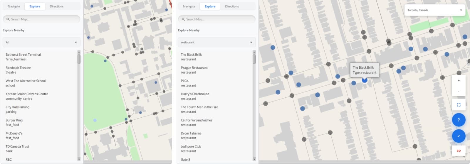
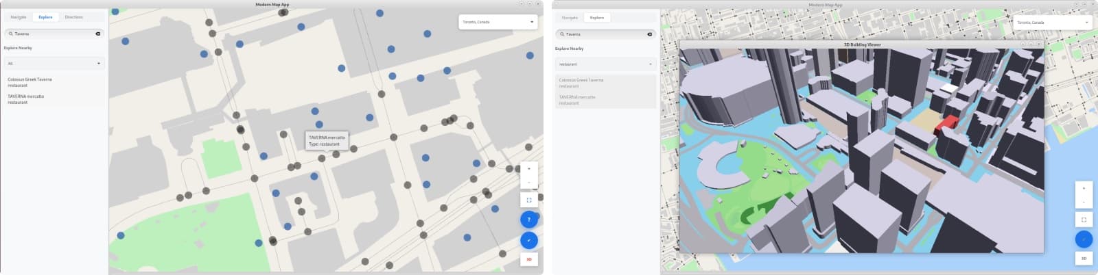
The Explore tab lists the places of interest near where you are looking, and narrows to a type, restaurants for example, with one dropdown. The list sits right beside the map on purpose. Fitts’s law says the time to reach a target grows with its distance, so keeping results next to the map they refer to makes moving between them faster.
Clicking a place takes you there: the map pans to it and labels it, which removes the manual step of finding a result on the map after finding it in a list.
Map Algorithms
Under the interface are the four problems every team in the course solves, and they are graded on speed as much as correctness. Each one below is the approach, how it differs from the obvious one, and what it measured.
Spatial Quadtree
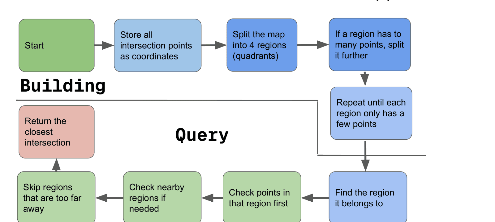
The first milestone is a question the map asks constantly: which intersection is closest to this point? Checking every intersection works for a small town and falls over for a city. So intersections are indexed in a quadtree. The map is split into four quadrants, any quadrant holding too many points is split again, and that repeats until every region holds only a few.
A query starts in the region the point falls in, checks those few points first, and only looks at neighbouring regions if the closest point found so far could be beaten there. Whole regions that are too far away to matter are skipped without being opened.
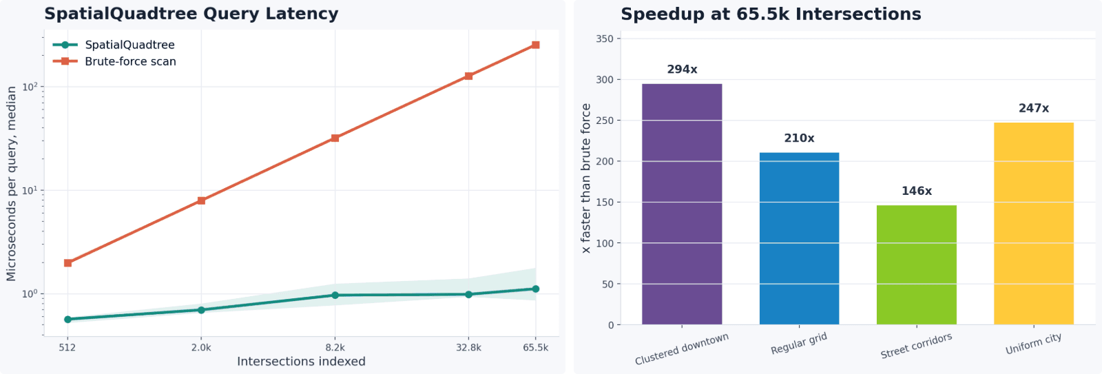
Benchmarked against a brute-force scan, query time for the quadtree stays almost flat as the city grows, while the scan grows linearly. At 65,500 intersections the quadtree is 146 to 294 times faster, depending on how the city is laid out, and fastest on a clustered downtown.
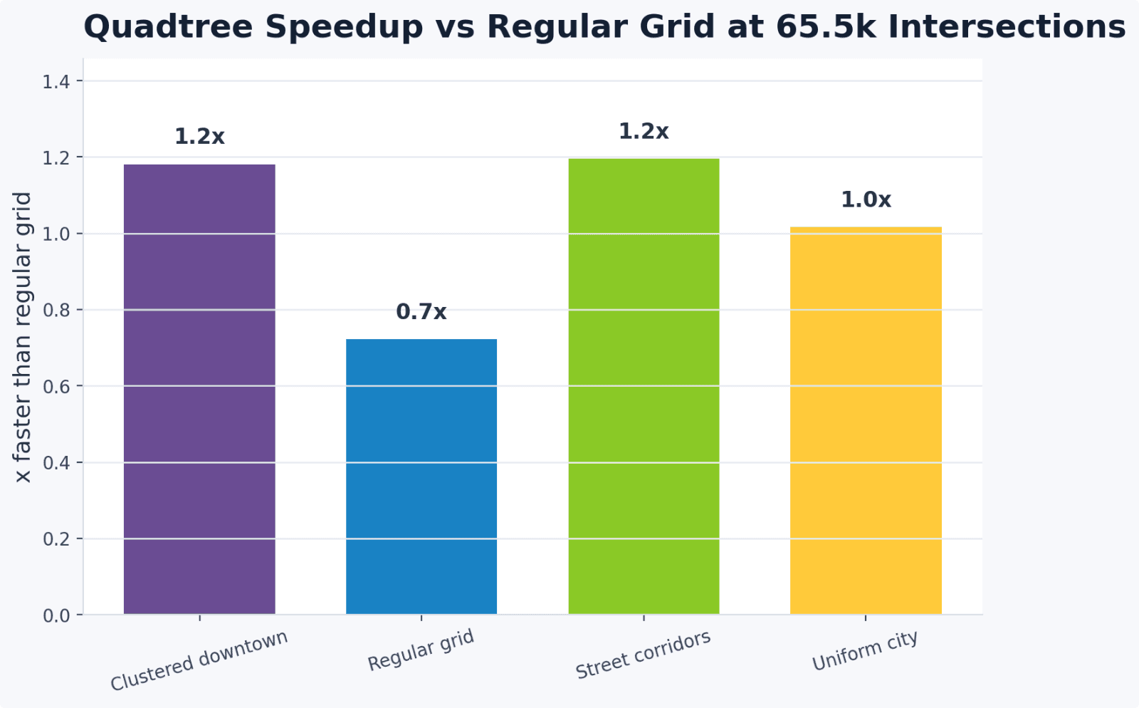
The more honest comparison is against a regular grid, the simple alternative. There the quadtree is 1.2 times faster on a clustered downtown and along street corridors, level on a uniform city, and 0.7 times as fast on a perfectly regular grid, where a grid’s cells already match the data. The quadtree earns its complexity on real cities, which are clustered, and loses a little on the one layout real cities rarely have.
Pathfinding
The third milestone is routing, and it runs on A* search. Roads are explored in order of travel time so far plus an estimate of the time remaining, following one-way rules and adding a cost for every turn, until the destination is reached. The route is then rebuilt from the saved steps.
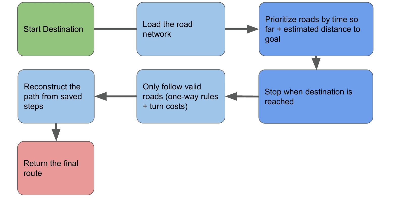
The estimate is the straight-line distance divided by the fastest speed limit on the map, which can never overestimate the remaining time, so the route found is always the fastest. The main speedups were caching: each segment’s travel time and each intersection’s neighbours are computed once and reused rather than recalculated on every search.
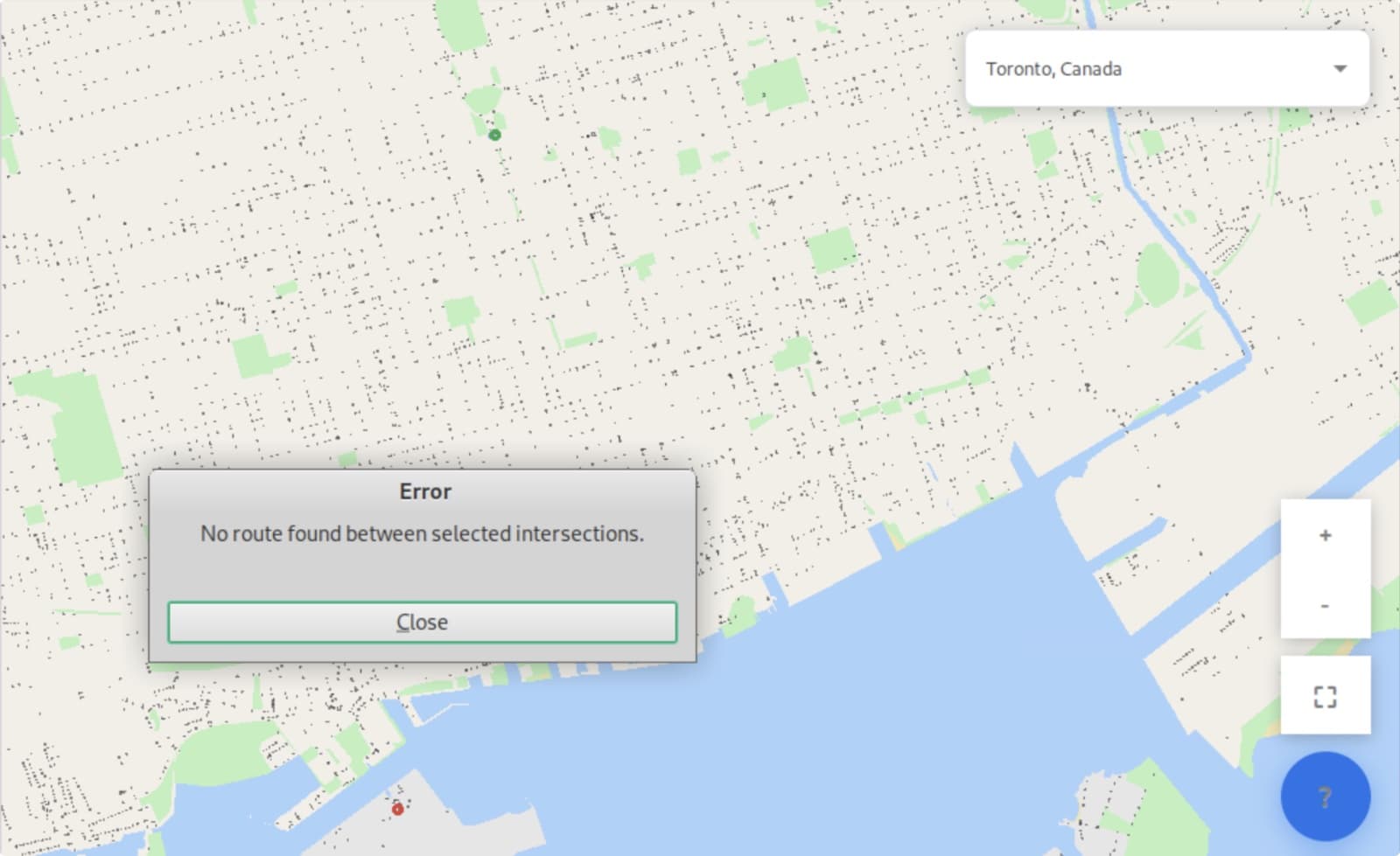
Edge cases are handled rather than hidden. Two intersections with no route between them, across water or into a closed-off area, get a clear message instead of a hang or a nonsensical path.
Intelligent Directions
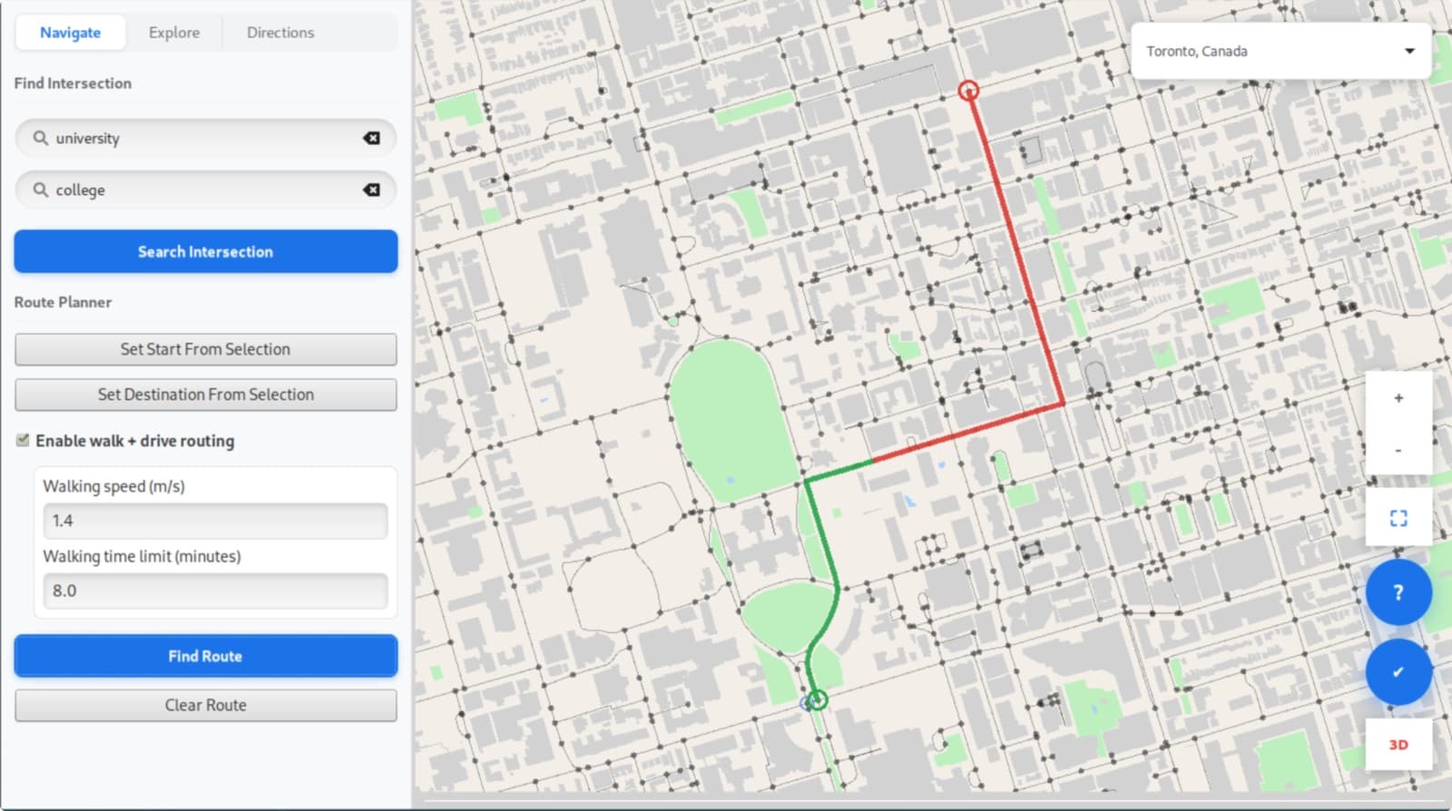
Real trips are rarely one mode. Mapper can plan a walk plus drive: you walk to a pickup point, within a walking speed and time limit you set, and are driven from there. It finds every intersection you could reach on foot in that time, then runs a single A* search from all of them at once rather than one search per candidate, which is what keeps it fast.
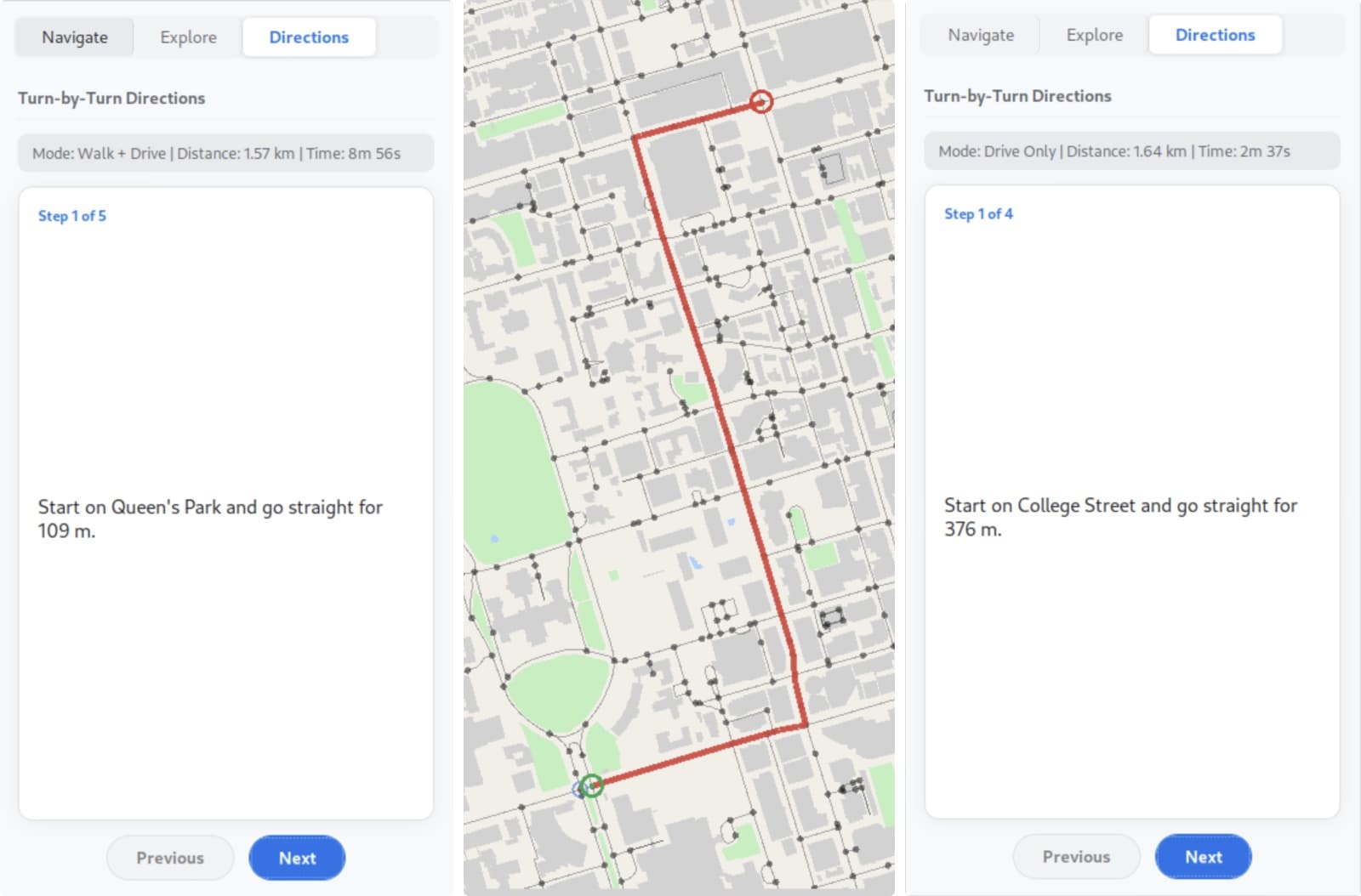
The Directions tab turns either kind of route into turn-by-turn steps, one at a time, with the total distance and time at the top. The same two endpoints give different instructions depending on whether you are walking part of the way or driving all of it.
Courier Optimisation
The fourth milestone is the travelling courier problem: the travelling salesman problem with more rules. A courier has a list of packages, each with a pickup and a drop-off, and must find the cheapest route that picks every package up before delivering it, all within a fixed time budget. Trying every possible route is out of the question; the number of orders explodes long before the list is long.
The strategy follows the standard approach from Johnson and McGeoch’s work on the problem. First, build a valid route greedily, always going to the nearest legal next stop. Then keep improving it instead of searching from scratch: try a small change to the route, decide whether it helps, and repeat until the time runs out, returning the best route seen. Deciding uses simulated annealing, which sometimes accepts a worse route early on so the search can climb out of a local minimum, and becomes strict as time runs down.
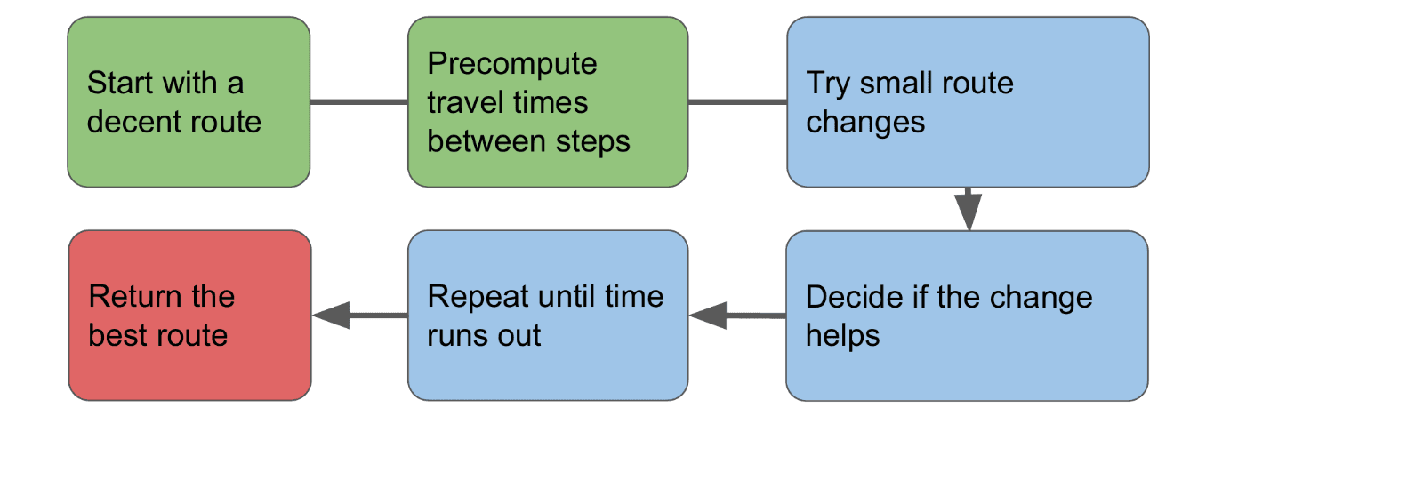
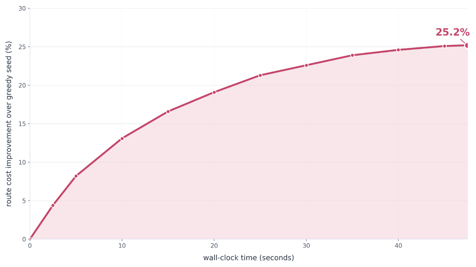
Three things improve the quality of the result. A good greedy start gives the search less distance to cover. Precomputing the travel time between every pair of stops once means each candidate change costs a lookup rather than a pathfinding run. And running the search on several threads explores more changes in the same time. Starting from the greedy route, annealing cut the total route cost by 25.2% within a 47.5-second budget.
A Walk in Toronto
Each of those pieces is useful on its own. The point of Mapper is what happens when they work together, and the clearest way to show that is a real errand: finding a rooftop restaurant in Toronto with a good view of the sunset.
It starts on the 2D map. The Explore tab filters nearby places to restaurants, and picking one opens the 3D viewer right over it, so you see the building itself before deciding anything.
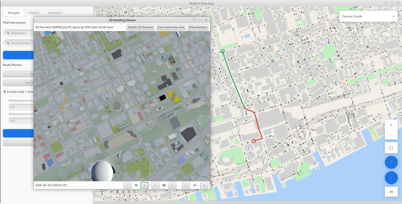
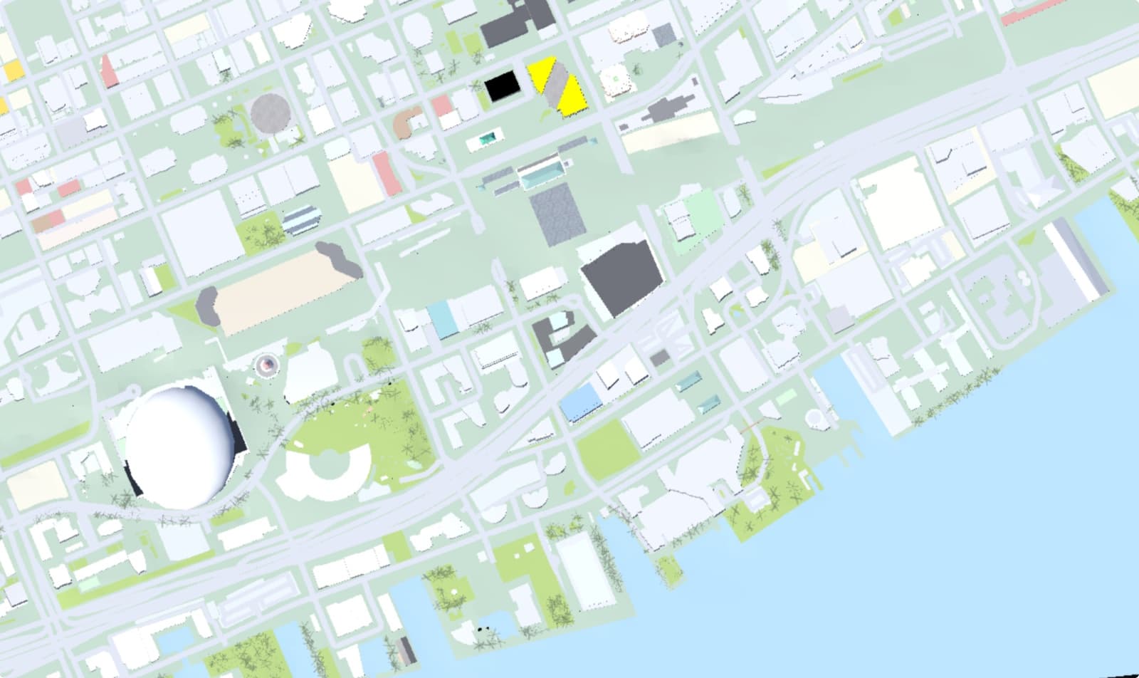
The walking route crosses the railway tracks, and where it crosses them is not obvious from a flat map. The 3D viewer’s 2D overview mode shows the textured city from directly above, right next to the route, which makes it clear where the crossing is.
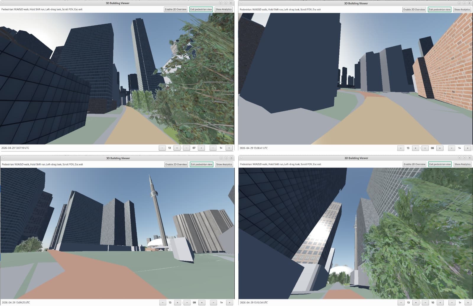
Then the walk itself, in pedestrian mode, at street height. The towers close in along the way, and the CN Tower comes into view as the route crosses the tracks: the kind of thing you would only otherwise learn by walking it.
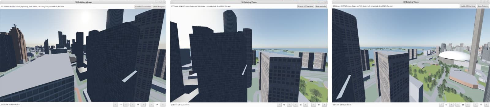
The route looks good, but the reason for the trip was the view. From the restaurant’s rooftop, the southeast is blocked by the tower next door, and so is the south. The southwest is open, which is where to sit.
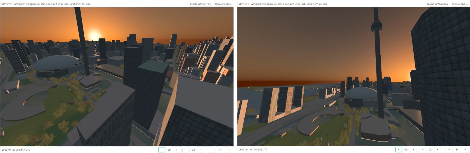
But the sunset is the point, so the clock moves forward to evening. The sun sets right behind the neighbouring building. The terrace would have been in shadow with the view blocked, which is exactly the evening no one wants, and exactly what a flat map could never have warned you about.
So it is back to search. The next option is KOST, another rooftop restaurant downtown. The same check, the same viewpoint, the same evening.
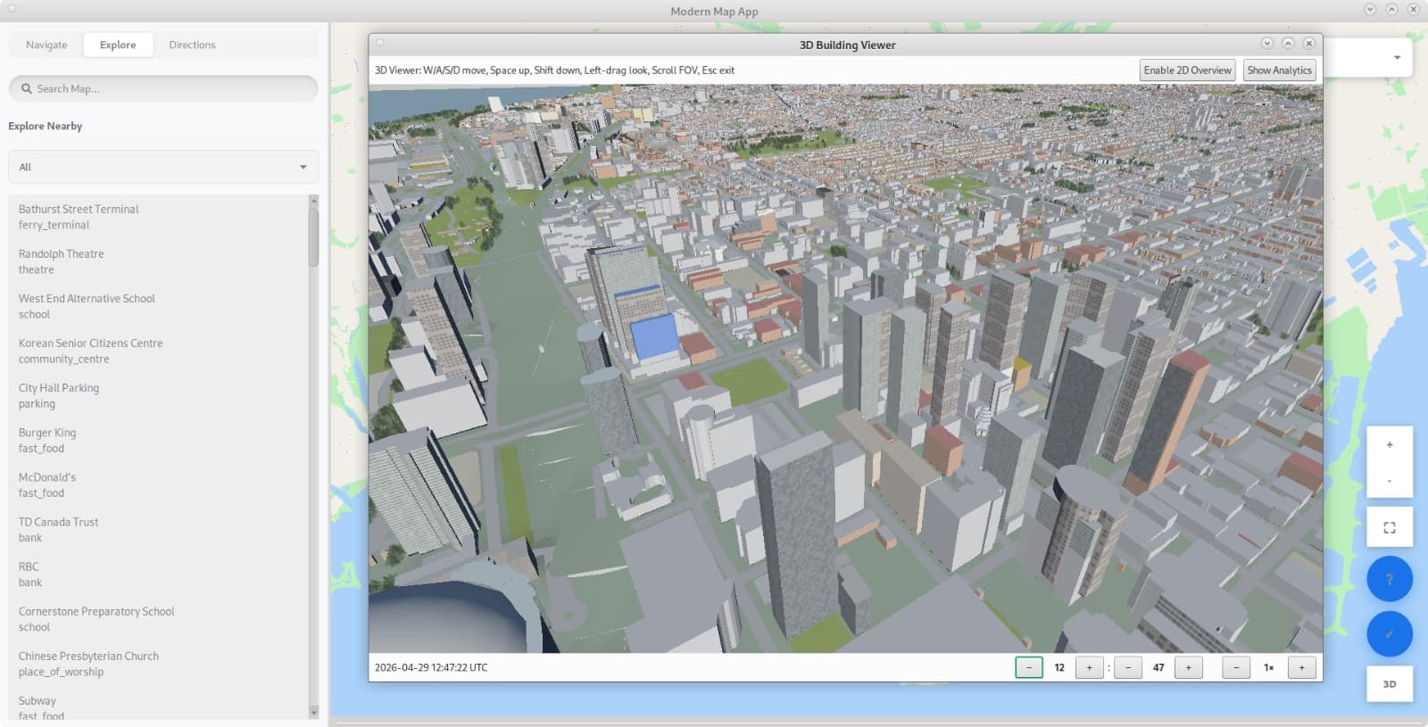
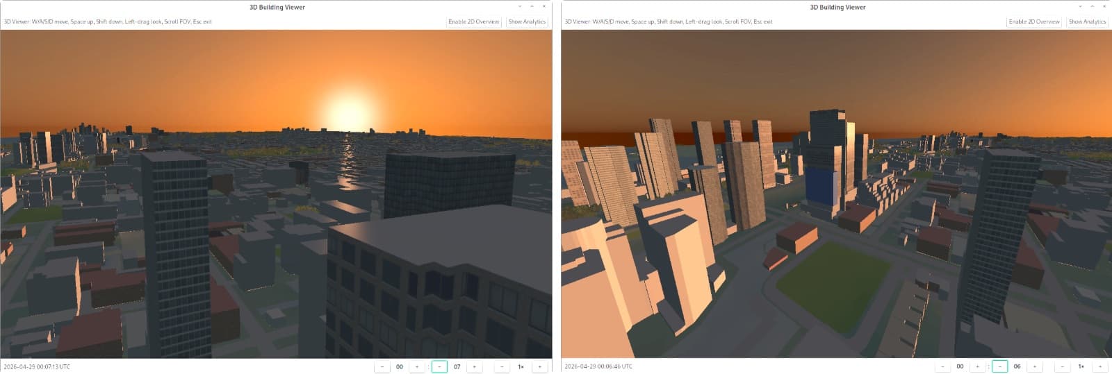
Much better. Every step of that errand used a different part of the project: search, the 3D handoff, routing, pedestrian mode, and the sun, working together to answer a question a map is usually not able to.
Pitch and Vision
The goal the project was built around is simple to state: make urban environments easier to understand and explore. The way it gets there is realistic rendering, of any city, at any time. The test is whether the render matches the real place, and the team checked it against their own photographs, taken on trips before any of this existed.
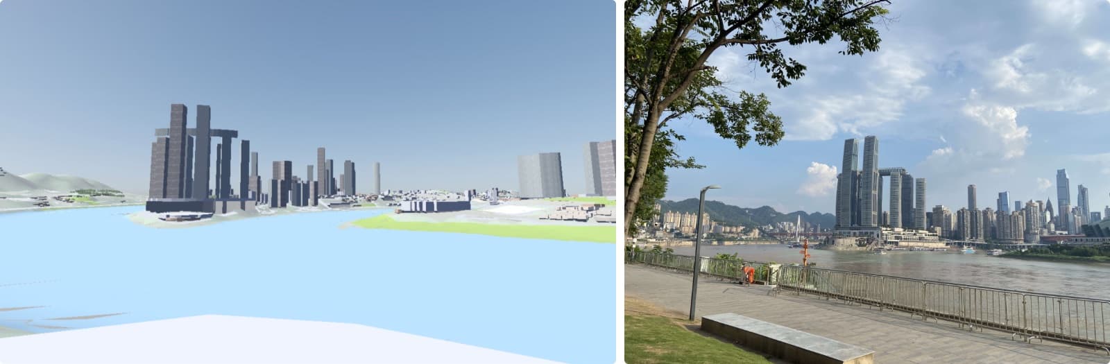
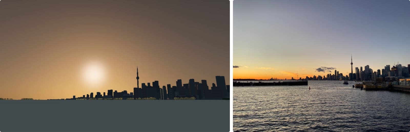
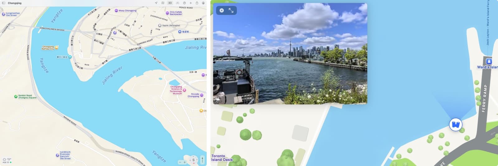
The obvious comparison is Apple Maps, which has both a 3D mode and Look Around. In Chongqing its 3D mode shows nothing at all. Look Around has real photography, but only where a camera car has been, and only at the moment the photo was taken. It cannot tell you what the view is like at sunset in December. Mapper can, anywhere OpenStreetMap has buildings, at any hour.
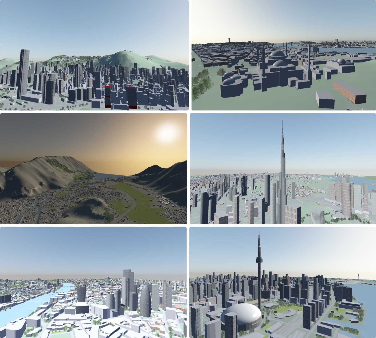
Nothing about it is tied to Toronto. The same pipeline renders any city in the data, with its own terrain, landmarks, and sky.
Improvements
The next steps go deeper into the same product rather than sideways into new ones, in three directions: better data, higher visual fidelity, and more interactivity.
Data Sources
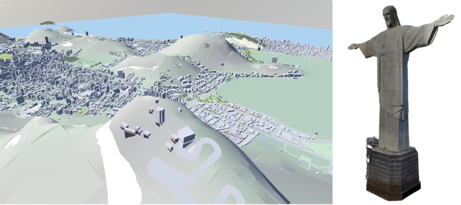
OpenStreetMap is excellent at buildings and poor at everything else. Some of the most recognisable landmarks in the world are not buildings at all: in Rio de Janeiro, Christ the Redeemer is simply missing from the mountain. Loading hand-made model meshes for landmarks like it fills the gaps where the data cannot.
Transit is the other gap. Streetcar rails and schedules, and the VIA and GO train lines, are missing from the render and from routing. Bringing them in would let directions include transit, and the rail corridor from the walk would appear as the tracks it actually is.
Visual Fidelity
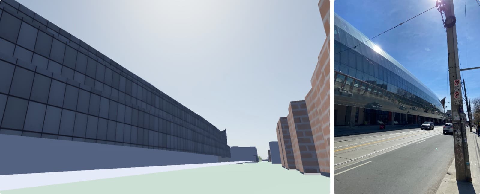
The renders are realistic; the next step is photo-realistic. Physically based rendering would let materials behave like the real thing, so the glass facade of the Art Gallery of Ontario reflects the street the way it does in person instead of reading as a flat blue wall.
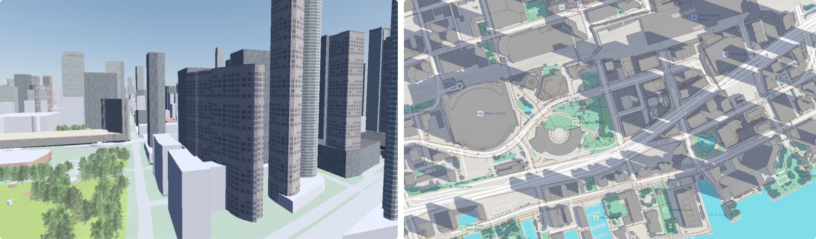
Shadow maps are the other half. Buildings and trees should cast shadows, and for a question like “will this terrace be in the sun”, shadows are the answer. Compared at noon with ShadowMap, a tool built only for that, the render shows lit buildings where the real streets are in shade.
Interactivity
A sunset spot is only a sunset spot if it is not raining. Weather would let the viewer answer the next question after “where is the view”, which is whether it is worth going tonight or whether to go somewhere else.
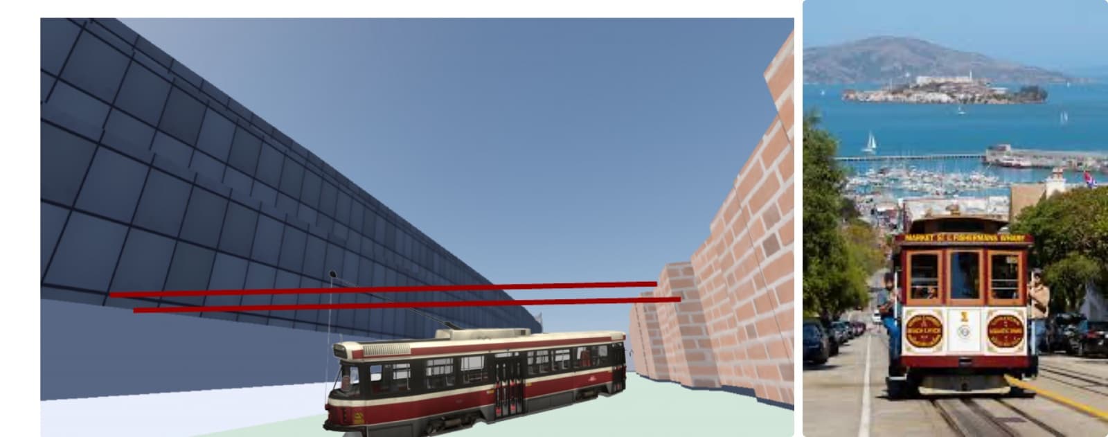
Moving vehicles would add the thing a render of a city most obviously lacks: life. In some cities transit is part of the identity, Toronto’s red streetcars and San Francisco’s cable cars among them, and seeing them move is part of what a place feels like.
Opportunities
The same renderer is useful well beyond maps, and two directions stand out.
The first is a digital twin for urban planners and architects: a live model of a city where you can add or change a building and see its impact straight away, on sightlines, on shadows, on the skyline. Digital twins are one of the fastest growing markets in software, estimated at around 41% a year, and cities already use them to plan for climate and change.
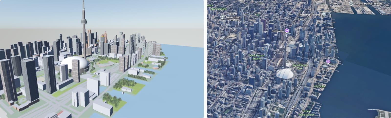
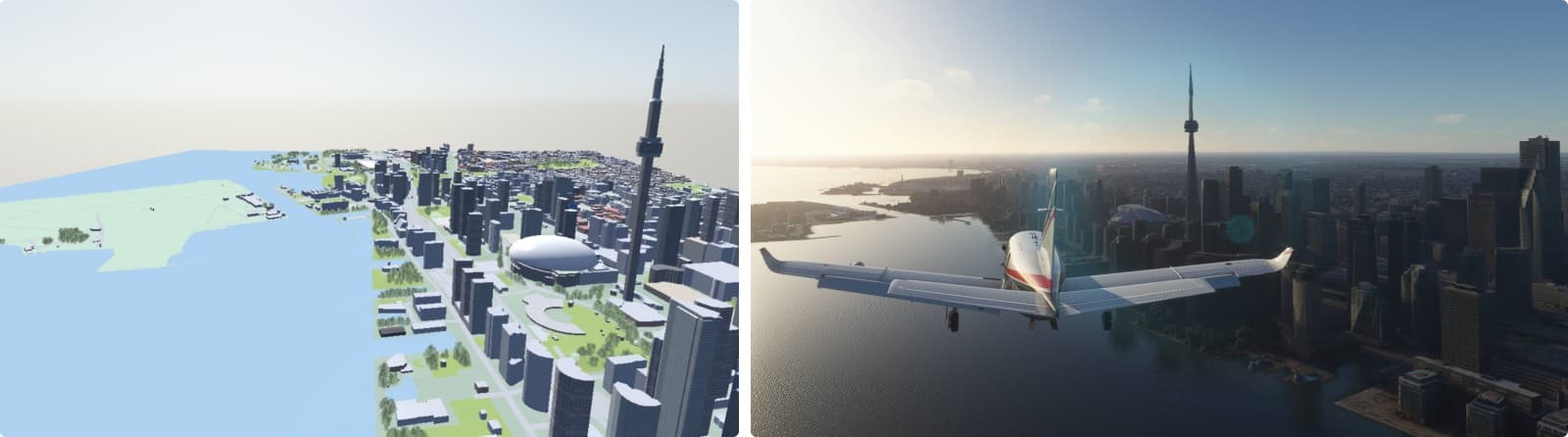
The second is simulation: flight, driving, and disaster planning. Photo-realistic renders plus flight camera controls and physics make a flight simulator, and even Microsoft Flight Simulator players have found Toronto’s CN Tower missing. The same engine serves urban air mobility research, where drone and air-taxi projects already build simulations on game engines, and the enthusiasts, gamers, and pilots who make up a growing flight simulation market.
The Real Goal
The project began with a goal about maps: make urban environments easier to understand and explore. Seen through a planner deciding where a tower should go, or a pilot learning an approach over a city they have never flown, it turns out to be a narrower version of a larger one.
Make spatial intelligence more accessible. Knowing what a place is like, what you will see from it, when the sun reaches it, and what changes if something is built beside it, has always needed either being there or expensive tools. Mapper is a first step toward having it for any city, at any time, on an ordinary laptop.